About My Profiles
RGB Working Spaces and Chroma Variant Sets for Photographers
— for unparalleled control over image color
March 7, 2017 (revised to mention Affinity Photo, July 20, 2020)
In the mid- to late-1990s, as I was learning mastery over color management, I discovered a serious gap in this modest but very important aspect of digital imaging. No one had ever yet created an RGB working space which was fundamentally well-conceived. A space which needed to function as a vessel for digitized color film needed to contain the colors as rendered from that film by a well-configured drum scanner simply didn't exist and as a result, scanned transparencies would routinely yield damaged or ruined images if stored in any of the available RGB spaces other than scanner space. But that wasn't a very good solution either, and neither was using Lab, where that was available. Scanner output was also limited to 8-bit precision after the original 14- or 16-bit capture, which especially hurt the Lab option. Scanner profiles didn't work right either, ruining deep shadow detail (and I fixed that too), but that's another long story. Same goes for printer profiles, which I also did a lot to help get working right, but that again is another long story. Imaging was new and quite rough around the edges, with many initial "good enough" solutions in need of upgrades.
RGB working spaces had been built with output gamuts in mind such as the very modest gamut of one of the SWOP printing standards in the U.S. (Bruce RGB) and the gamuts of Trinitron and DiamondTron CRT displays (Apple MultipleScan 17 RGB and ColorMatch RGB). Pro PhotoRGB and the literally accidental and ill-conceived Adobe RGB (1998) hadn't been created yet. sRGB was another effort of the day which we used to jokingly call "satanic RGB" when I was working at Live Picture, and not because we liked it (it wasn't so much evil as just somehow genuinely annoying). It's gamut was an attempt to match an ideal, standard display of the time, but the problem with that concept was that not only could it never actually hope to achieve a close match to a high percentage of displays for a period of even several years owing to rapidly changing technology, but it was just absurd as a space intended as an archiving vessel i.e. as a working space for precious images as were the other CRT-based spaces. They were all OK as display spaces, even generic ones, but not as working spaces. Since its introduction, display gamuts have been all over the map and are lately trending toward much larger gamuts than sRGB. It's done it's job OK, inasmuch as the great majority of colors in pictures fit into it, but a working space for serious work it is not. Thankfully, color management's penetration of the display systems of the world has been pretty well completed after far too many years of foot dragging in the implementation of ICC standard mechanisms, including support from at least what I think of as the major browsers as well as from the major OS's and the vital imaging applications too. What this means is that we can begin to dare to use larger gamuts for images intended for high-end web display, as needed to preserve their proper chroma, rather than having to assume that a major portion of our audience will be looking at our work with what one might call faithless displays.
My Ektachrome Space (now replaced with Chrome Space 100) was the first input-centric working space ever published and it could and has functioned beautifully as a proper vessel for the full range of our images from color film. Not as a generic display/output space guaranteed to badly clip many images, but as a safe harbor for all of our valuable images in color.
Ektachrome Space, as the name implies, was aimed at serving the dominant digital workflow for digitizing and working with transparencies made on Ektachrome film, but serves equally well for other transparency types including the Fujichrome and Agfachrome families as well as Kodachrome, despite small differences in the gamuts of the processed film from each family. The latest generation of Fujichrome films have a somewhat larger gamut owing to the use of spectrally cleaner dyes, and I preserved the option to create a second Chrome Space with a higher numerical value as an indication of increased gamut volume by adding "100" to the name of the original gamut, but never actually found a compelling need for such a mildly enlarged Chrome space. Scans of color negatives are fundamentally different because when done correctly the output colors of the scanner profile refer to the scene, not to the film, but even they worked very well with the Ektachrome Space gamut. Nowadays I have a more theoretically ideal solution for color negative scanning (DCam 3), but in my own fairly extensive experience scanning negatives with accurate color renditions, Ektachrome Space worked fine for color negs too.
Ektachrome Space went on to morph into two versions: Ekta Space PS 5, an early version hobbled by the meager initital color management support which Adobe gave us in Photoshop 5, by being forced to adopt a gamma tone curve (2.2), and Chrome Space 100, a slightly improved version of the original Ektachrome Space with a more refined tone curve delineated with many times more points and re-named to avoid confusion with Ekta Space PS 5. Their shared gamut remains the gold standard for storing scans of transparencies, which, I might add, can now thankfully be carried out remarkably well with digital cameras in place of drum scanners.
Not long after this first round of working space design, I went on to solve a huge problem of color control, which cried out for the ability to craft color intensity in a non-damaging and aesthetically pleasing way inside of an RGB imaging workflow, to give the dimension of color in a photograph the same kind of respect which tonality had long received. You could say that it's roughly analogous to the 'Zone System', as Ansel used to refer to the basic processes of controlling tonality in B&W photography. The solution was what I came to call Chroma Variants — profiles which were like a given master RGB working space, but which when assigned to the image impart varying levels of Chroma to the image, either positive or negative, for more or less color, whatever the photographer might need, in fine steps. The process is uniquely free of processing damage and yields a very low level of perceived shifting of luminosity in colors which are gaining or losing colorfulness, as the human sensation of "saturation" is officially called. Because they change only the Chroma of an image, the L* (lightness) and the Hue remain absolutely constant. Thus the minor residual apparent shifting of lightness is owing to solely the shortcomings of L*a*b* space as a perfectly perceptually uniform construct with respect to L*. By contrast, typical RGB mode saturation tools generally ruin an image if a substantial change in saturation is made, owing to the much larger changes in perceived luminosity which attend saturation adjustments with the primitive mathematical models employed by these tools. And increasing the Chroma with a plus variant also never causes any clipping. Nor does a variant's use result in any changes of the actual RGB values of the file — yielding both instantaneous and totally damage-free as well as wholly un-doable adjustments with files of any size, which can be counted on to give wonderfully pleasing results. In Photoshop and with adjustment layers (also now in Affinity Photo and with adjustment layers). They even make it possible to apply local chroma adjustments by masking a separate image layer if you should want, or to go up, not to a maximum of +99% but for the rare case needing more, to go up with a two-round process to far beyond that. Problem solved.
One drawback is that you need a separate set of variants for each working space that you might want to use. This amounts to quite a bit of functional redundancy, which is why I've always concluded that subsequent full-set purchases should result in a substantial discount, especially given that there are now more reasons to work in more than just one master space in the era of digital capture. I've just re-worked the pricing a bit to simplify it and to increase the average discount for subsequent sets on the occasion of opening my second online store, with FastSpring, replacing my original profile store with Kagi. All sets with chroma variants are now $90 USD and all subsequent sets are $50, if a coupon is obtained for any purchase made later. I've also got deep, multi-seat educational discounts for institutions.
The Third Chapter: When digital capture finally reached the point where I could make the switch from 4 x 5" film and my beloved Linhof outfit, such as I'd relied on for 35 years, I could see that once again no ideal solution for RGB working spaces for digital captures existed, though ProPhoto RGB is at least what I'd call a respectable effort. It works. It just isn't ideal in a few ways. The variability of image gamuts from digital cameras is far larger than that from color transparencies. The idea of a one-size-fits-all master RGB working space to store my precious master image files from any of my digital cameras was just not acceptable to me. The largest gamuts required are larger than the most colorful transparency, yet it's very common for the required gamuts to be far smaller than Chrome Space 100. Plus I much prefer non-gamma tone curves so as to better match the tonality of the working space to a well-behaved printer, to minimize harm during the unavoidable output conversion.
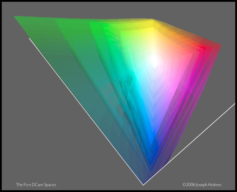
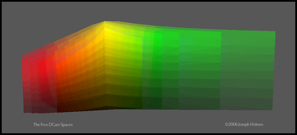
So began the long process of looking for the sweet spots in a progression of gamut volumes and for the ideal gamut shapes (primaries) for a suite of digital camera working spaces. I wanted to ensure that rather than just having a regularly-spaced series of spaces, each bigger than the last, that each would be particularly well suited to an identifiable class of images or purpose and make the most sense possible as standards in and of themselves. The reasoning behind the tone curve creation employed to create Ektachrome Space (Chrome Space 100) applies equally to what became the new DCam series of five spaces.
Here are two views of their gamuts in Yxy space:
 |
 |
||
| The Five DCam Spaces, top view | The Five DCam Spaces, side view | ||
For a long discussion of RGB working spaces and issues of their design, go to All About RGB Working Spaces In General.
For a comparative introduction to my spaces, go to About My Master Spaces and Chroma Variant Sets in Detail.
To view the gamuts of all the master spaces, go to my Gamut Graphics page.
To purchase profiles, go here.
Here are my eight working spaces, counting the monochrome one:
DCam 1, J Holmes
DCam 2, J Holmes
DCam 3, J Holmes
DCam 4, J Holmes
DCam 5, J Holmes
Chrome Space 100, J Holmes
Ekta Space PS 5, J Holmes
Monochrome, J Holmes
I offer nine Chroma Variant sets in all, including sets for ProPhoto RGB and Adobe RGB (1998) as well.
My Chroma Variant sets remain the best available method to control the colorfulness of images in an RGB workflow, IF you are working inside of Photoshop or any application offering full color management support, including the ability to assign profiles to images. I have been relying on them for some two decades now as the primary instrument of color control in my own work. Photographers all over the world consistently rave about them and I couldn't do my work without them!
Available Profile Products lists of all of my currently available profiles and is the place to purchase profiles or download the free one.
FAQs and Tips include installation instructions for Macintosh or Windows, how to use them, etc.
Testimonials is the place to check out some of my many glowing user testimonials. You can get a sense of what they have done for my own work by perusing my gallery pages, which show work from four classes of film and from a variety of digital cameras, the latest of which is, all things considered, my favorite camera ever by virtue of the stunning image detail, tonal range and color integrity which it so readily affords.
Examples of Chroma Variant Effects provides two downloadable progressions that illustrate the effects of the variant sets.
Legal:
All of my profiles, including chroma variants, are copyrighted material and may be used by license only. It's OK for the licensee to personally use them on up to three computers. It's OK for the licensee to send out an image with any of my profiles embedded into it for the sole purpose of having the file printed or seen properly. The free profile (Ekta Space PS 5, J Holmes) may be used by anyone, except that it may not be added to software without my written permission, it may not be altered under any circumstances, and it may not be distributed except from my web site (links welcome), except by written permission. Service bureaus may however supply scans to their customers with Ekta Space PS 5, J Holmes embedded without my permission, though a link to this page would be appreciated. Thank you.